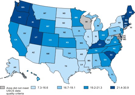
This map shows the rate of the occurrence of skin cancer by state in 2005. The darkest states had the highest percentages of skin cancer and the lighter states had the lowest percentages of skin cancer.

Here's a graphic showing the different appearances of skin cancer. The captions describe the details of the moles. If any mole appears like this on your body then contact a doctor to be reviewed.

On this graph you can see the percentages of Americans diagnosed with skin cancer in 2004.
Please visit: www.dermanetwork.org for great information on taking care of your skin and various things that may affect its health.